As we sit here in the perpetual LCD-screen glow of the 21st century, fantasizing about the floating cities and moon-bounce bridges that will populate the urban amusement park we all are apparently yearning to live in, we have much in common with our urban predecessors, all of whom wanted to remake their inherited spaces and carve out a new logic for living. The ancient Greeks used their colonies to roll out the rationalist grid system. The Renaissance Italians, frustrated by their narrow, crowded medieval streets, sketched ideal Vitruvian cities full of proportion and symmetry and devoid of people. In the U.S., 18th-century agrarian idealists organized Westward Expansion in an ever-unfolding grid of six-mile-square townships. Le Corbusier, grossed out by the dirt and disarray of the modern industrial city, compartmentalized every bit of urban space into its own safe little OCD box.
In the new exhibition "Grand Reductions: 10 Diagrams That Changed Planning," the nonprofit urban think tank SPUR tracks the history of urban desire in its most distilled form: the diagram. On view at SPUR's San Francisco storefront through February 15, "Grand Reductions" unravels the ideals and anxieties lurking behind seemingly unassuming maps. The orthogonal is political!
Save this image to a collection
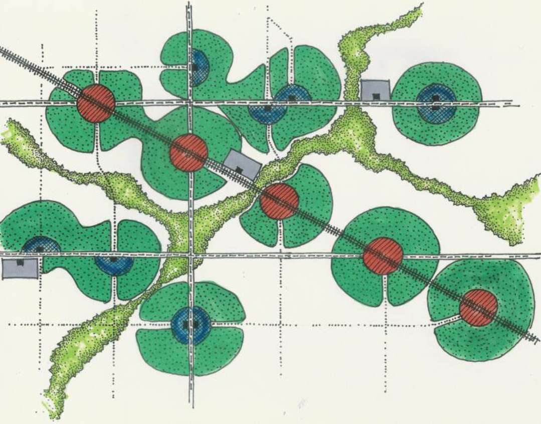
Today's vogue for transit-oriented development (TOD) owes a lot to Ebenezer Howard's Garden City. Image courtesy of Wayne M. Davis
In addition to advocating for an ideal future, each diagram rather summarily undiagrams the past. When the early-20th-century stenographer and amateur inventor Ebenezer Howard considered the pollution and chaos of the industrial city, he saw centralization as the main problem. Howard's influential 1902 publication Garden Cities of To-Morrow laid out his concept for a sequence of small "smokeless, slumless cities" extending over the English countryside, separated by idyllic greenbelts and linked by railroads and canals. Planned as communities of 32,000, Howard's garden cities would relieve the congestion of urban centers and offer workers the best of city and country life, complete with collectivist yet quaintly British social services (ahem, "homes for waifs"!).
Howard's ideal cities inspired the development of two communities near London—Letchworth and Welwyn—but they also anticipated one of today's important planning trends. As Ben Grant, SPUR's public realm and urban design program manager, writes in the show's accompanying essay, "Nearly a century later the graphic treatment of circular pearls on a string of transit infrastructure would be picked up by planners advocating transit-oriented development."
Save this image to a collection
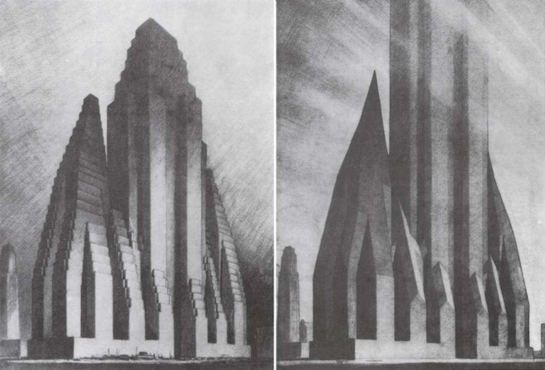
The architectural draftsman Hugh Ferriss's 1922 charcoal sketches of imaginary Manhattan skyscrapers. Image courtesy of SPUR
There's nothing like a freshly drafted building code to stoke the fires of artistic inspiration. As new construction techniques and the birth of the elevator made skyscrapers a possibility for the first time, the concept of air rights—and a new form of legal battle—was just waiting to be invented. In the 1920s, Progressive Era laws introduced setback rules to preserve light, air, and views, and to prevent eager builders from turning surface streets into dark, cavernous places. Armed with a code book and a set of charcoals, the architectural draftsman Hugh Ferriss sketched out the implications of the new law, turning dry code stipulations into brooding drawings of what must be the most responsibly proportioned Batcave ever.
Save this image to a collection
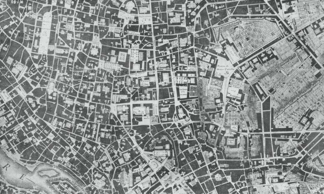
Giambattista Nolli's 1748 map of Rome emphasizes urban pattern by highlighting streets in white. Image courtesy of SPUR
Like the wheels on our food trucks and fixed-gear bikes, aerial-view maps may not seem like such a revelation. But the way they define space says a lot about who a city is for. By rendering travel routes in white, Giambattista Nolli's 1748 map of Rome emphasizes the logic of the streets and the navigability of the city. But when modernists came along in the mid-20th century, they reversed positive and negative space, showing buildings in white and everything else as an undifferentiated void. "In the ethos of modernism, the building is this sacred object that needs to be set off in a vast field of space," explains Grant. "But from the point of view of a human being moving through that space, it's a very anxiety-producing environment."
Grant contrasts modernism's wide, undefined voids between buildings with traditional urbanism, which uses readable street edges and recurring, human-scale patterns and paths to allow pedestrians to easily orient themselves within the larger landscape. "If you imagine yourself standing in the middle of a housing project or a mall with a giant parking lot, that's not a very pleasant place to be a human being, but it's hard to put words to why," he says. In the 1970s, planners revived Nolli's convention of using white for streets as a way of articulating the failings of modernist schemes. Adds Grant, "It's such a hard thing to explain, but when you see one of these images, it's like, 'That's what a traditional city does that the modernist city doesn't do.'"
Save this image to a collection
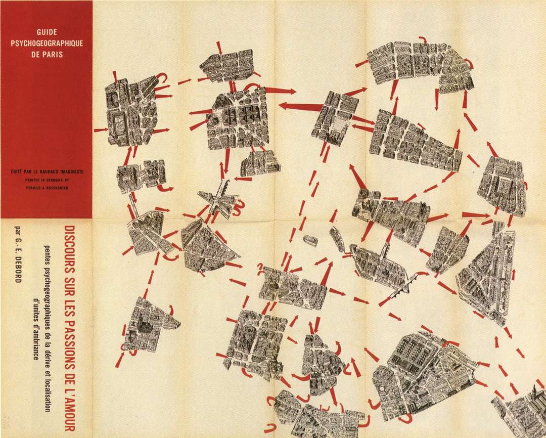
Guy Debord’s 1957 "Guide Psychogeographique de Paris" maps a walk through Paris as a series of personal encounters with the unfolding city. Image courtesy of SPUR
No hay comentarios:
Publicar un comentario