Inland Empire (2006)
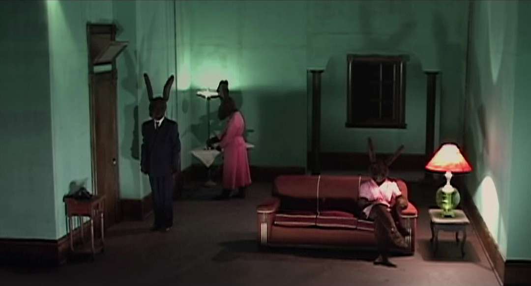
Mientras que algunos se basan exclusivamente en los diseñadores de producción y departamentos de arte para dar una película a su forma y color, directores como David Lynch tejen la arquitectura en la narración hasta que no se distingue de la totalidad. Lynch rompe las reglas de oro de la dramaturgia y, en lugar de depender de la buena estructura vieja de tres actos, introduce nuevas formas más ambiguas de la narración de historias. Si hay una geometría de identificación de las películas de Lynch, es la cinta de Moebius. Lost Highway (1997) se abre y se cierra con el mismo tiro hipnótico de la carretera de dos carriles con la línea central de color amarillo canario, creando un circuito cerrado cuyo giros geometricos con las imágenes casi de espejo de doble personalidad de Fred. En Mulholland Drive (2001), la tela de torsión de la fantasía esquizofrénica del protagonista se funde con la realidad como Diane, interpretada por Naomi Watts, se enfrenta a su trastorno de doble personalidad. Siguiendo la regla geométrica de la tira, el argumento no es distinto en el interior o en el exterior - no hay momentos discretos en el que se rompe el carácter. En cambio, la ilusión recibe reflejos distorsionados desde el otro lado y fluye desprevenido de su dirección y la inevitabilidad del bucle.
Carretera perdida (1997)
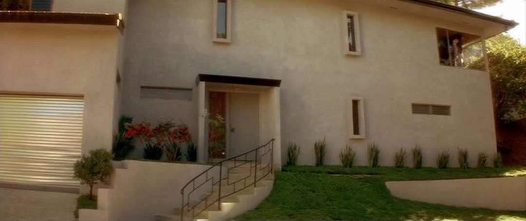
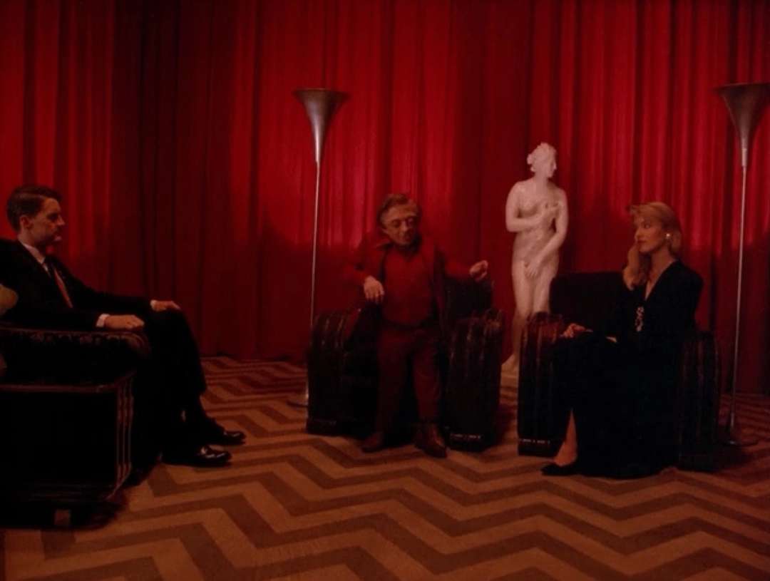
Aunque estas cualidades geométricas abstractas no pueden ser el resultado de un esfuerzo consciente para llegar a una especie de claridad geométrica, otros aspectos de las películas de Lynch y los intereses personales del director, denuncian su implicancia con el espacio construido y la expresión arquitectónica. La casa de Fred Madison en Lost Highway es una de las tres propiedades en la misma calle de la derecha de Mulholland Drive propiedad de David Lynch. A pocos metros de distancia se encuentra la residencia de la directora, diseñado por nada menos que Frank Lloyd Wright. Numerosas entrevistas citan mencionarlo entre sus arquitectos favoritos - Pierre Chareau, Mies van der Rohe, Rudolf Michael Schindler y Richard Neutra. La famosa frase de Neutra de casas no ser máquinas, sino "etapas para vivir" viene a la mente, ya que se comunica perfectamente con la forma en que Lynch trata a sus interiores. El apartamento minimalista en Eraserhead (1977), que se describe en el libro de Justus Nieland en Lynch como "un interior vanguardista", la decoración burguesa de la habitación de Merrick en El hombre elefante (2001), el Salón Rojo en Twin Peaks (1990) y la casa- fortaleza, al igual que en Lost Highway, son puntos focales en respectivas puestas en escenas de las películas. Son lugares de la ambigüedad y el espectáculo.
Carretera perdida (1997)
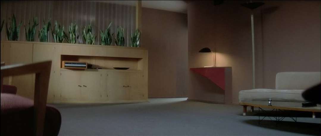
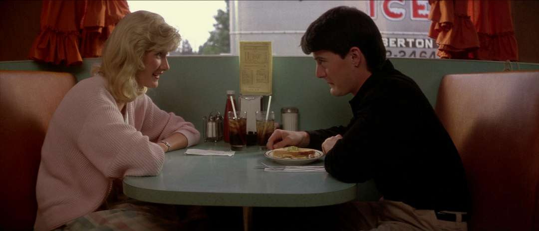
Lynch es famoso por su uso de un diseño de mediados de siglo. Diners, máquinas de discos, pasteles, y cómodos sofás son caricaturescos en su sencillez y son casi un guiño nostálgico a la época. Lo suyo para el 1950 se basa en el concepto del sueño americano y la realidad socio-cultural de la época que marcó su primera infancia. Fue una época de grandes gastos, la mayor parte de los cuales era doméstica y dirigida hacia la adquisición de todas las marcas registradas de "la buena vida." La década de 1960 vio los movimientos de derechos civiles que expusieron las raíces profundas de la inmovilidad social en la sociedad estadounidense, y la década de 1970 eran marcados por el escándalo Watergate, que provocó la desconfianza generalizada en el aparato estatal y pronto fue seguida por una recesión económica.
Twin Peaks (1990)
El ambiente incómodo en las películas de Lynch, con el apoyo de incursión ocasional en el surrealismo, presagia la desaparición y la destrucción de la utopía consumista realizada. Destaca visualmente lo que es inherente a todas las representaciones de la utopía (los arquitectónicos incluidos). La exageración y la uniformidad, incluso cuando se basa en la heterogeneidad, llevan un elemento de lo bizarro y lo terrorífico. Es el pensamiento de su realización que les da un aire "creepy". Del mismo modo, las paredes de color pastel enfermizos de los interiores de Lynch referencian a los colores de la década de 1950, pero tienen un matiz amenazante que te hacen inquietar nerviosamente en la silla. Lynch permite una representación inmersiva de la vida doméstica y equilibrada, pero utiliza los colores que ya han comenzado a pudrirse con la decadencia.
Blue Velvet (1986)
Most of the architecturally relevant films are not films about architecture. Architectural documentaries may provide an in-depth look at some of the most relevant buildings out there, but few of them manage to break out of the format of filmed coffee table books. A number of feature films, on the other hand, play around with a wealth of spatial conditions that illuminate the subtle complexities of lived space. Film directors aware of the shared vocabulary between architecture and film use spatial cues whose workings tend to remain fairly inconspicuous, but are perceivable by the sensitive retina of the architect’s trained eye.
Inland Empire (2006)
While some rely exclusively on production designers and art departments to give a film its shape and color, directors like David Lynch weave architecture into the narrative until it is indistinguishable from the whole. Lynch breaks the golden rules of dramaturgy and, instead of relying on the good old three-act structure, introduces new, more ambiguous forms of storytelling. If there is an identifiable geometry of Lynch’s films, it is the Möbius Strip. Lost Highway (1997) opens and closes with the same hypnotic shot of the two-lane road with the canary-yellow center line, creating a closed loop whose geometry twists with the almost mirrored images of Fred's dual personality. In Mulholland Drive (2001), the twisting fabric of the main character's schizophrenic fantasy merges with reality as Diane, played by Naomi Watts, confronts her split personality disorder. Following the geometric rule of the strip, the plot has no distinct inside or outside — there are no discrete moments in which the character breaks. Instead, the illusion receives distorted reflections from the other side and flows unsuspecting of its direction and the inevitability of the loop.
Lost Highway (1997)
Although these abstract geometric qualities may not be a result of a conscious effort to reach a kind of geometric clarity, other aspects of Lynch’s films and the director’s personal interests denounce his involvement with built space and architectural expression. Fred Madison’s house in Lost Highway is one of the three properties on the same street right of Mulholland Drive owned by David Lynch. Just a few feet away is the director’s own residence, designed by none other than Frank Lloyd Wright. Numerous interviews quote him mentioning his favorite architects — Pierre Chareau, Mies van der Rohe, Rudolf Michael Schindler and Richard Neutra. Neutra’s famous line on houses not being machines but “stages for living” comes to mind, as it communicates perfectly with the way Lynch treats his interiors. The minimalist apartment in Eraserhead (1977), described in Justus Nieland’s book on Lynch as “an avant-garde interior,” the bourgeois décor of Merrick’s room in The Elephant Man (2001), the Red Room in Twin Peaks (1990) and the fort-like house in Lost Highway are focal points in the films’ respective mise-en-scenes. They are places of ambiguity and spectacle.
Lost Highway (1997)
Lynch is famous for his use of mid-century design. Diners, jukeboxes, pastels, and streamline sofas are caricatural in their simplicity and are all but a nostalgic nod to the era. His thing for the 1950s is rooted in the concept of the American Dream and the socio-cultural reality of the period which marked his early childhood. It was a time of big spending, most of which was domestic and directed toward acquiring all the trademarks of “the good life.” The 1960s saw civil rights movements that exposed deep roots of social immobility in the American society, and the early 1970s were marked by the Watergate scandal, which caused widespread distrust in the state apparatus and was soon followed by an economic recession.
Twin Peaks (1990)
The uneasy atmosphere in Lynch’s films, supported by occasional excursion into full-on surrealism, foreshadows the demise and the shattering of the consumerist utopia realized. It visually emphasizes what is inherent to all depictions of utopia (architectural ones included). The exaggeration and uniformity, even when based on heterogeneity, carry an element of the bizarre and the horrific. It is the thought of their realization that lends them an air of creepiness. Similarly, the sickly pastel walls of Lynch’s interiors reference the colors of the 1950s, but have a menacing undertone that make you fidget nervously in your chair. Lynch paints an immersive picture of the well-balanced domestic life, but uses colors that have already started to rot and decay.
Blue Velvet (1986)
No hay comentarios:
Publicar un comentario