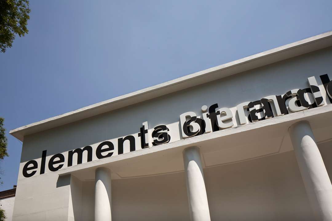
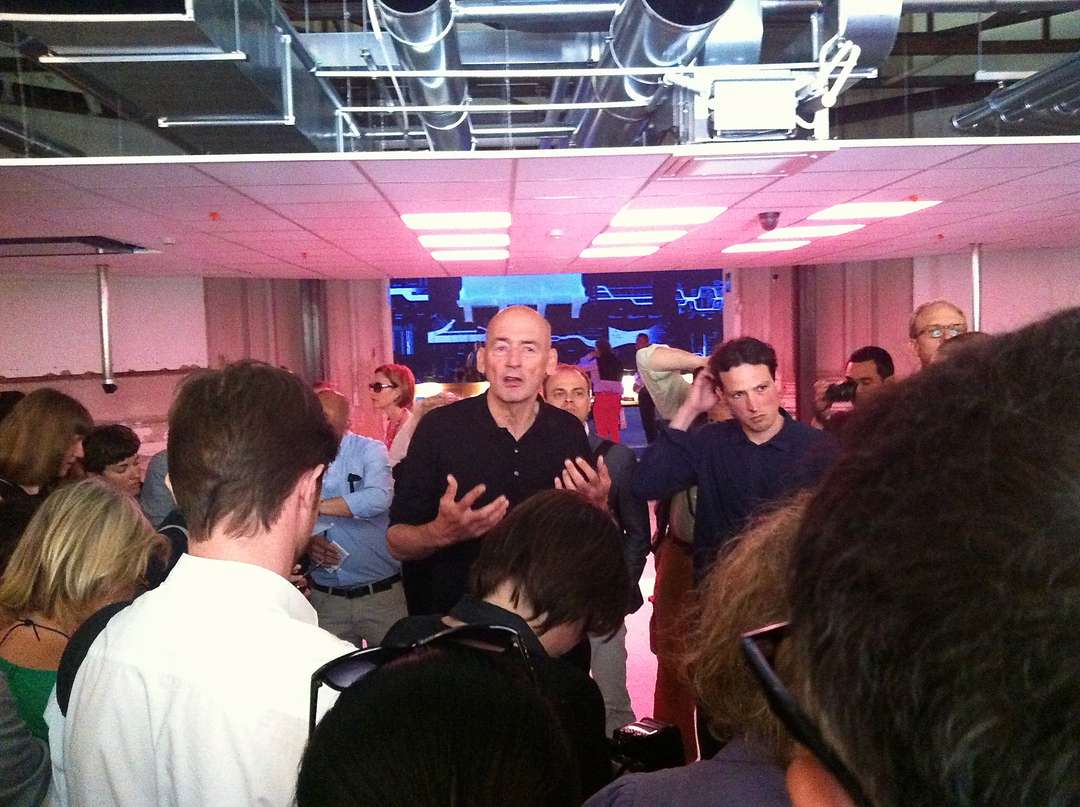
“Architecture is schizophrenic,” declared Rem Koolhaas, director of the 14th International Architecture Exhibition in Venice. To break away from today’s digital obfuscations and celebrity culture in architecture, Rem’s taking this year’s Biennale in a different direction. “You could say this entire Biennale is entirely about the effects of modernity on countries and architecture,” explains the architect.
So: Reconsider modernity. That’s quite the brief for curators, so for the section of the Biennale’s central pavilion that Rem curated himself (alongside a slew of university luminaries and students), the theme is broken into “elements.” Very, very basic elements that eschew complex theory and parametric delights in favor of pure knowledge parsed into specific components that span the last 100 years of architecture. Explains Rem, “By looking at them under a microscope, unsuspected (hi)stories and qualities emerge.”
Below, we re-present Rem’s lesson plan for audiences the world over. Consider this your Venice course by correspondence (but with much better designed infographics).
Photo By Francesco Galli. Courtesy la Biennale di Venezia
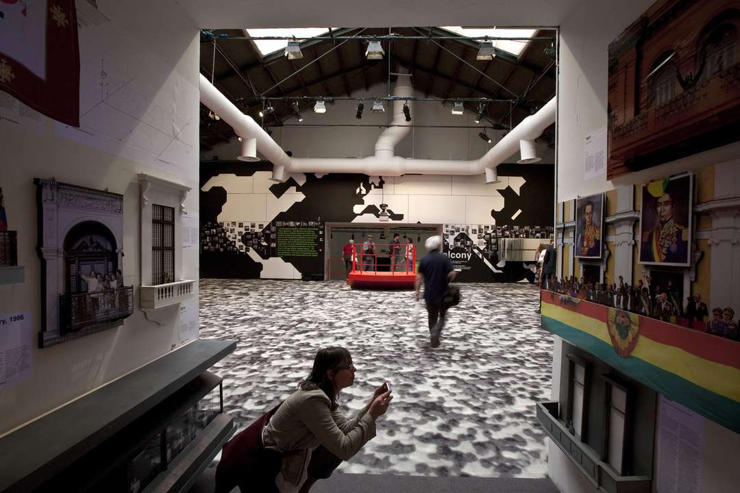
Balcony
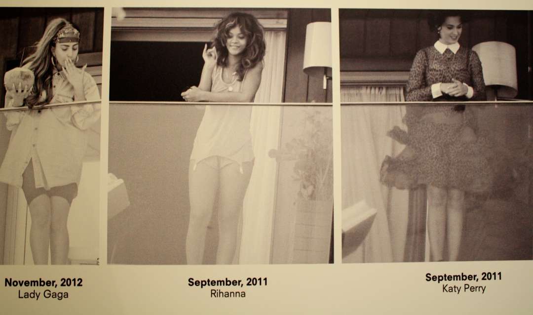
One particular balcony highlighted in Venice is that of the V Hotel in Rio de Janeiro, also known as “that balcony.” Explains Rem, “Far more than politics, today we associate the balcony appearance with fame. Celebrities are the only ones left who keep faith in the balcony as a means to engage with the city, albeit in a mutant, Internet-age form.”
Photo By Francesco Galli. Courtesy la Biennale di Venezia
Ceiling
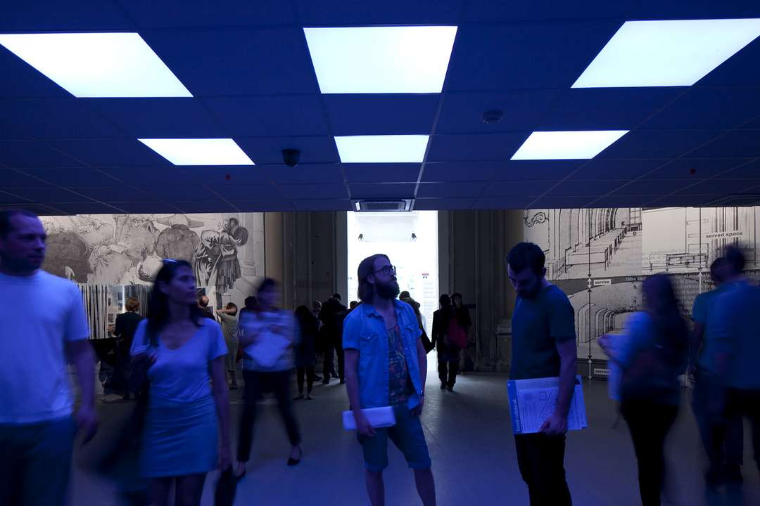
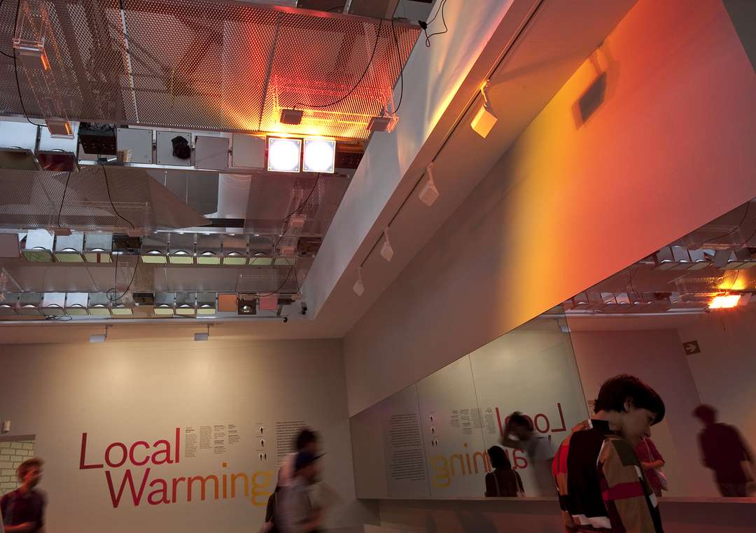
Those stale white tiled structures we toil below everyday at the office are termed a false ceiling. There’s a whole world of pipes, ducts, cables, and security paraphernalia up there. In this case, Rem presents a 2011 false ceiling to be installed in Qatar.
Corridor
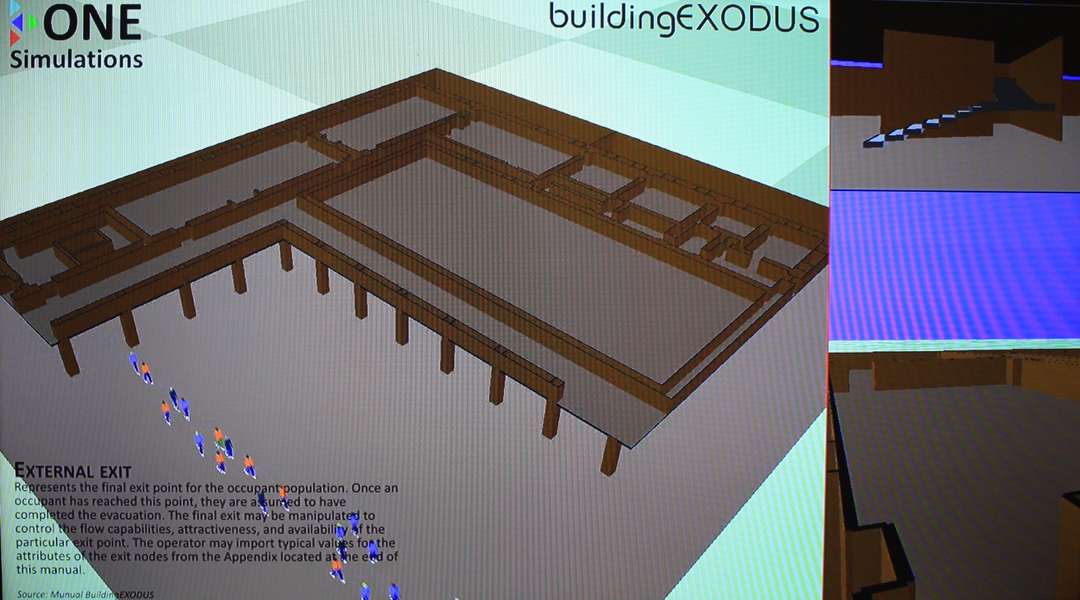
“Corridor” is what you say when you mean “hallway” but want to sound a little more proper and perhaps British. Or, a corridor can take the form of a maze of secret tunnels discovered in 1982 underneath Mussolini’s headquarters at the papal palace. As depicted by ONE Simulations, the subgrade corridor points in the direction of the Colosseum.
Door
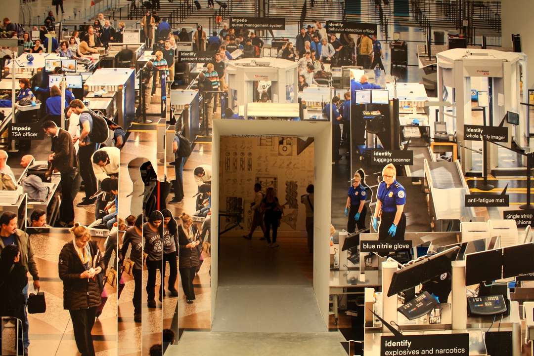
The dystopian experience of airport security comes into focus in Rem's kaleidoscopic vision of a Transportation Security Authority checkpoint. Today, the TSA boasts no less than 20 separate checks on travelers. Explains Rem, “The airport becomes an endless door stretching out ahead of travelers,” standing in contrast to the palaces built in the glamorous Jet Age of the 1960s.
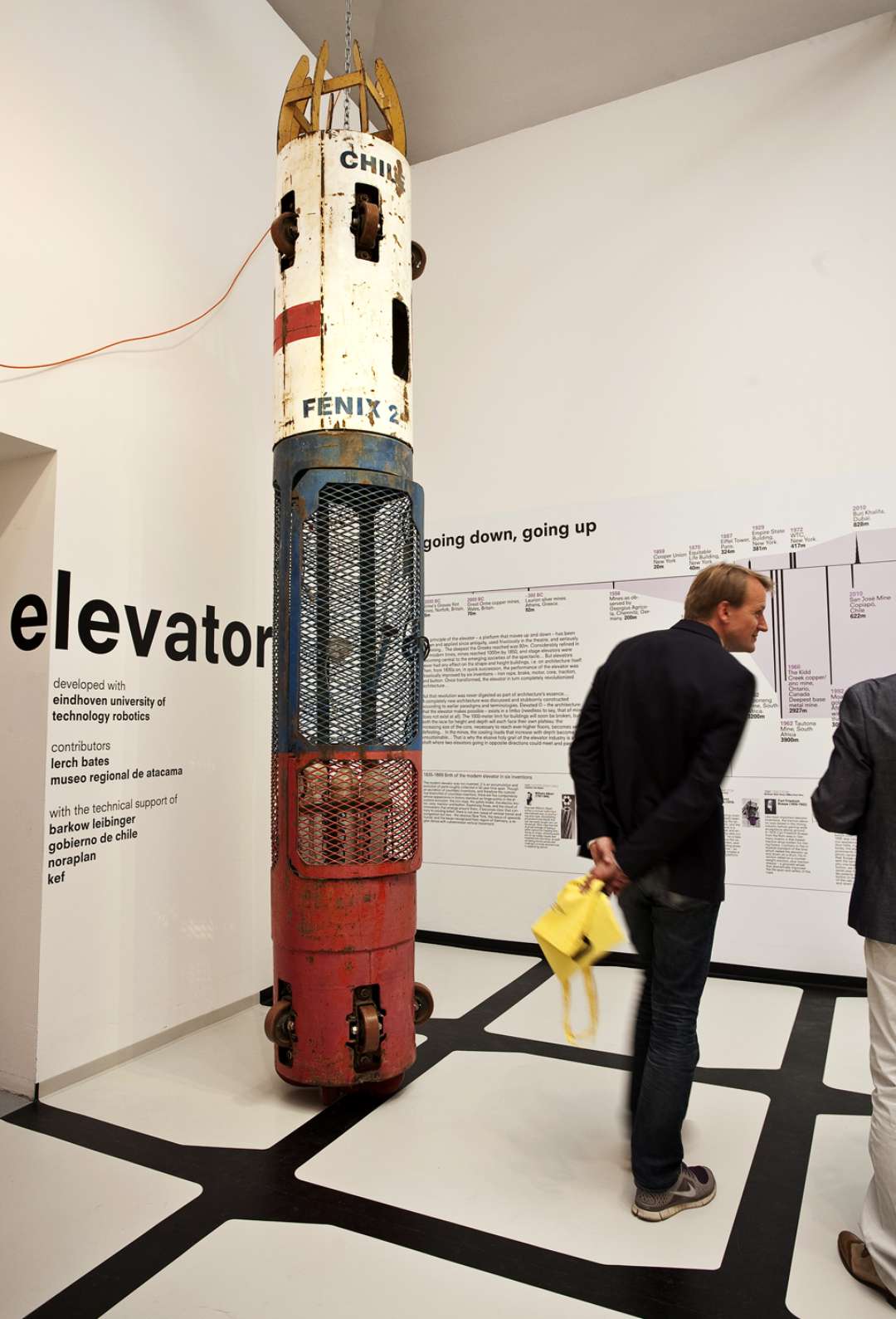
Elevator
This gem isn't your typical small-talk elevator, but a device used to rescue trapped Chilean miners in 2010, one by one. Architecture to the rescue.
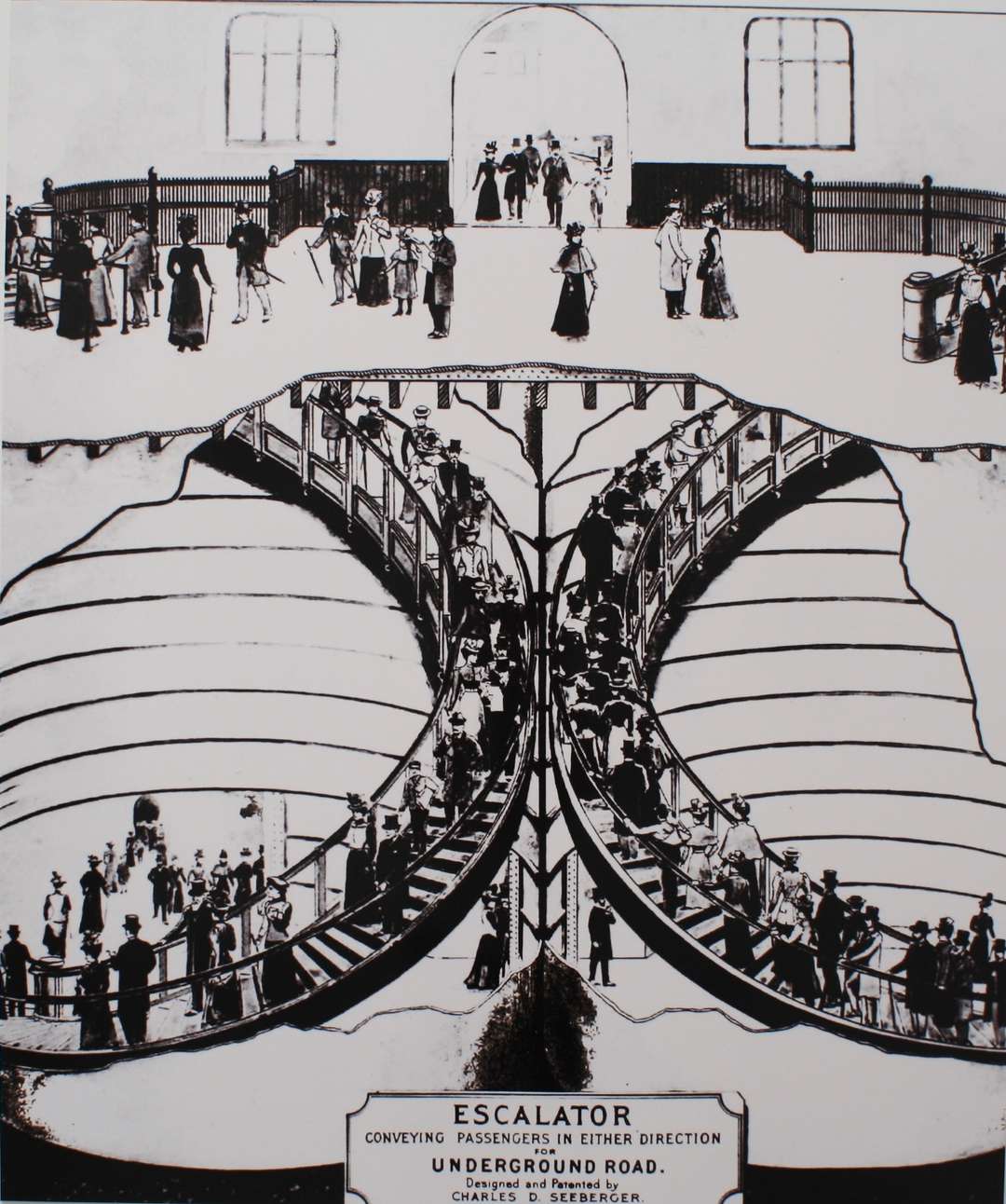
Escalator
Around 1911, Londoners fell in love with duplex spiral escalators — or fell in love with the idea of the duplex spiral escalators. That idea floundered in multiple underground stations, but lives on in Rem’s exhibition.
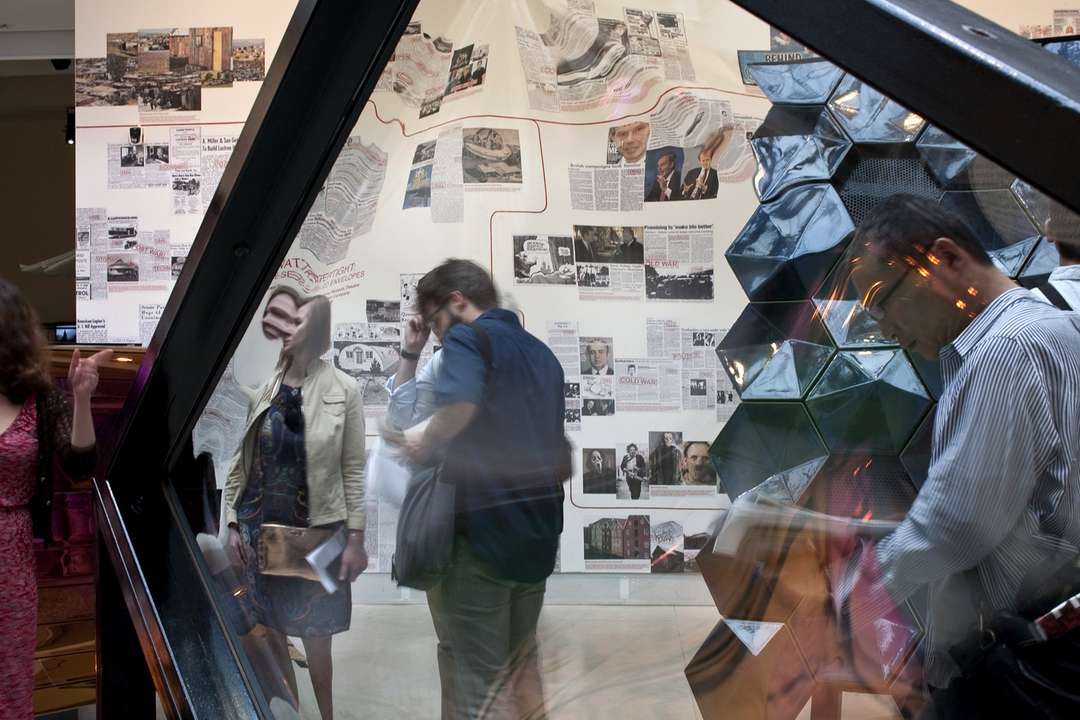
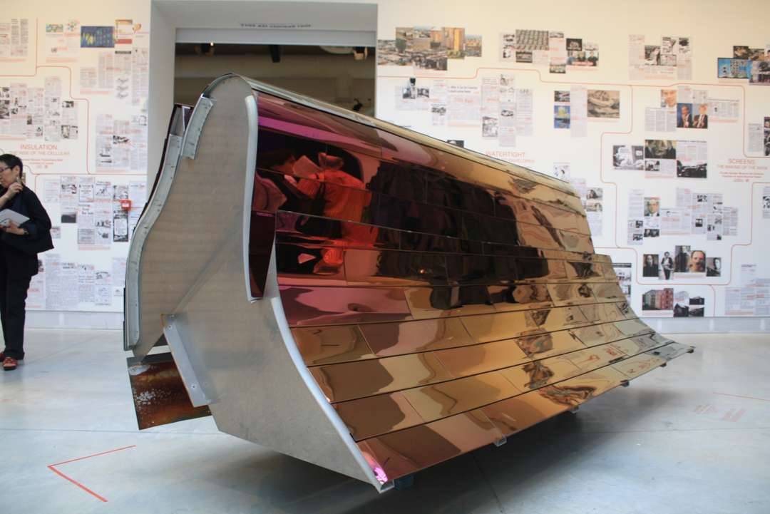
Facade
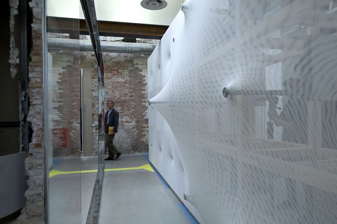
Despite its bling, discotheque aesthetic, this watertight, face-sealed facade sample from Philadelphia’s Suzanne Roberts Theater offers a low-cost system for irregular shapes. No longer merely for extravagant cupolas, the technology has found its way to new typologies.
Fireplace
In the future, heating systems will be hyper-personalized and motion sensor-activated.
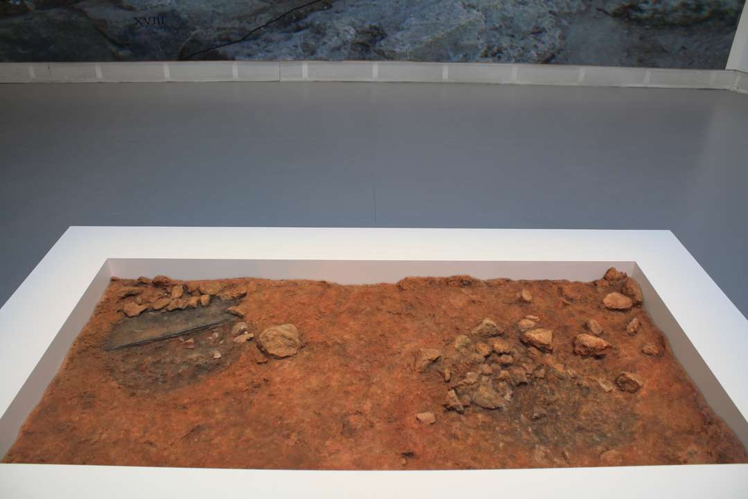
For those seeking a more communal experience, there's always this 228,000-year-old hearth excavated south of Valencia, Spain.
Floor
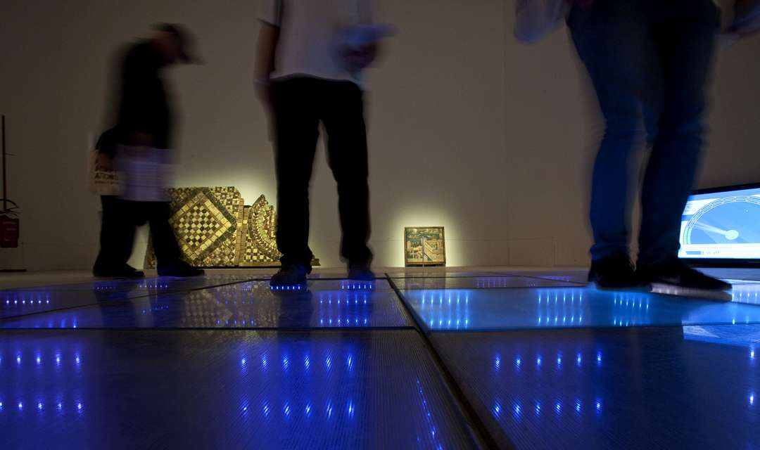
This sample of a Rotterdam dance floor produces a maximum output of 20 watts per dancer — enough to power the lighting of the floor itself. Sadly, the Sustainable Dance Club closed in 2010.
Ramp
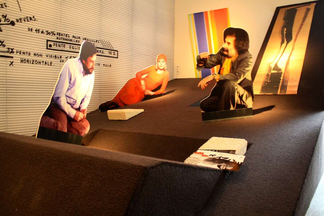
Explains Rem, "the ramp has the potential to fulfill the long-held desire to have a life of uninterrupted continuity." Here, we're presented with a reconstruction of Claude Parent's oblique Neuilly house. Image quality: 1. Sex appeal: 10.
Roof
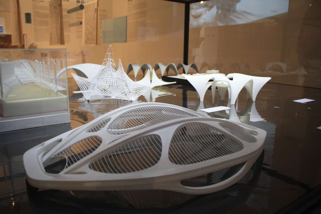
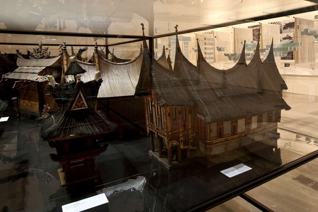
Zaha makes a cameo in the Elements exhibition by way of her controversial Tokyo stadium. This parametricism acts as a foil to the regionally informed styles found in the presentation of roofs found in an 1103 Chinese architecture manual, the Yingzao Fashi.
Stair
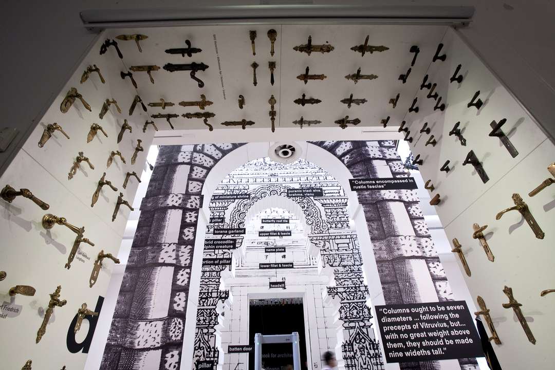
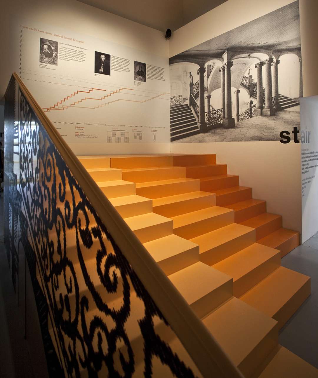
Notes Rem, "According to Friedrich Mielke (born 1921), the stair is 'the queen of architecture,' though it never gets the attention it deserves. Or as Renaissance master Leon Battista Alberti put it, "The fewer staircases that are in a house, and the less room they take up, the more convenient they are esteem'd." Bonus points for prismatic orange tones.
Toilet
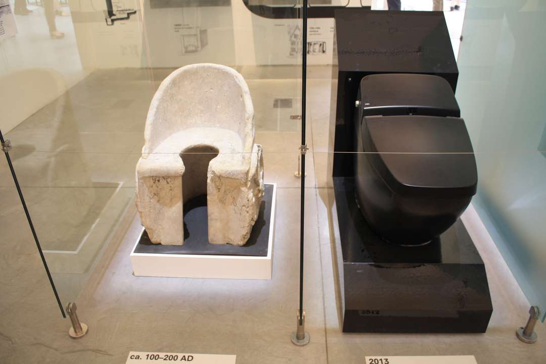
Contrasting with a ca. 100-200 AD chariot latrine from the baths of Caracalla in Rome, we have the Inax Satis Washlet. This toilet has everything: an automatic seat (triggered by a body sensor); automatic deodorizing (air in the bowl is siphoned through a charcoal filter and expunged); a “plasma cluster” ion generator meant to create “fresh air [as] in a forest or near a waterfall;" adjustable front and rear washing; music; night-light; emergency alarm; and a nozzle that emerges on command, expelling temperature and pressure-controlled water. We highly doubt that that ancient throne can also synch with your iPhone to track your waste schedule.
Wall
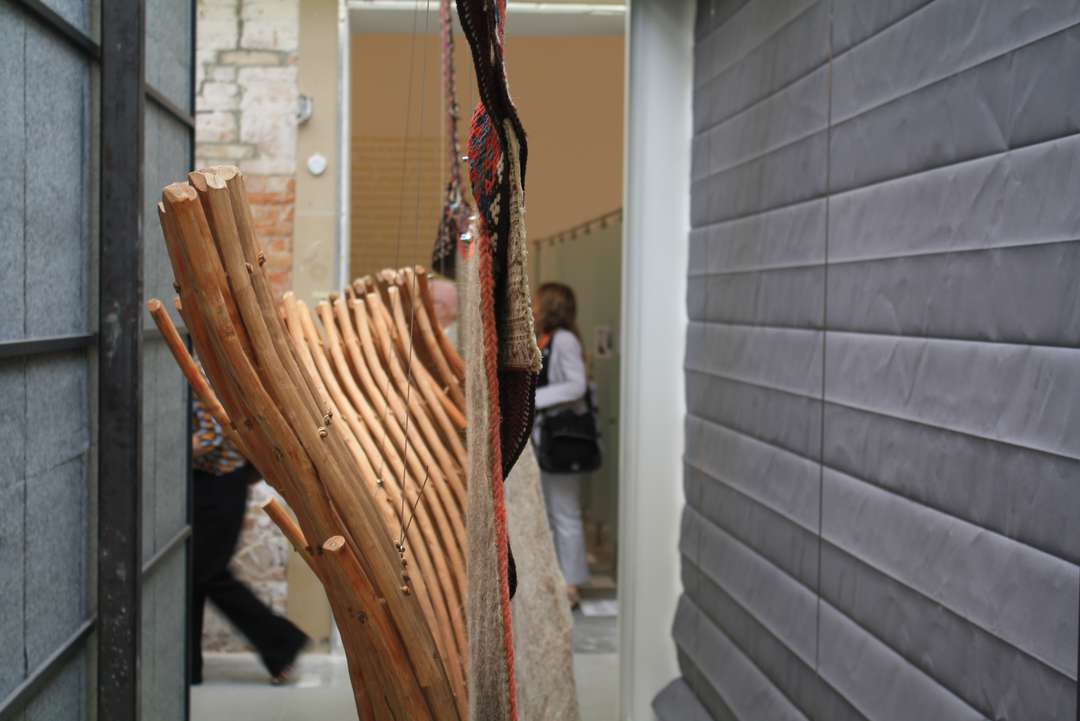
The DIY yurt is here. Among other examples, exhibition takes apart the 1,500-year-old central Asian dwelling’s walls. When done right, the wool covering can last up to 100 years, while the structural core has a lifespan of 150 years.
Window
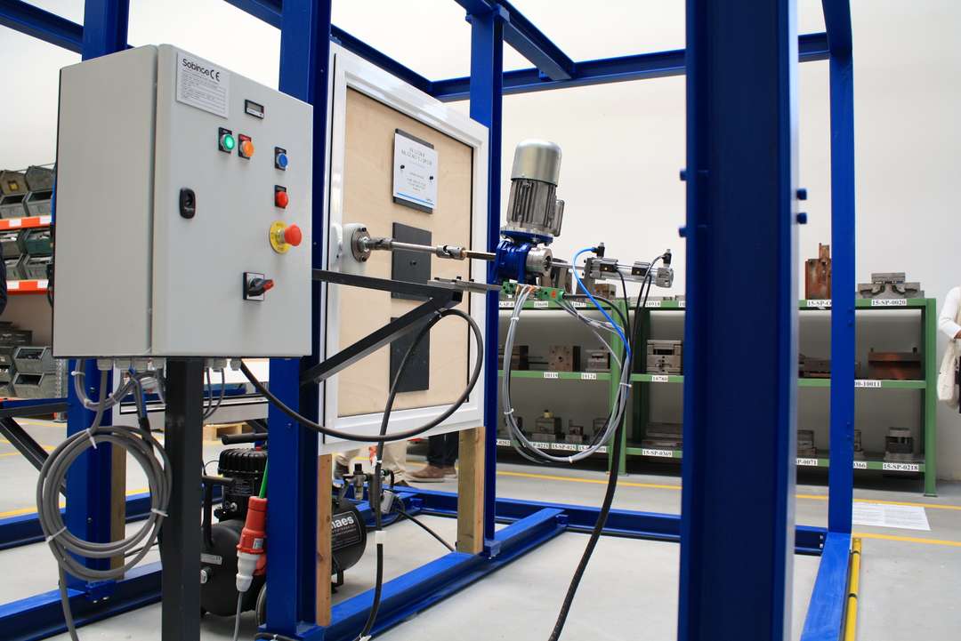
No, you’re not allowed to touch the buttons. When first unveiled in Belgium in 1961, this stress test machine for windows set a new precedent for EU laws, using pneumatic machines to test windows for up to 25,000 cycles. It’s like spin class, for windows.
Fuente> http://architizer.com/blog/rem-koolhaas-teaches-you-the-elements-of-architecture-in-15-steps/
No hay comentarios:
Publicar un comentario